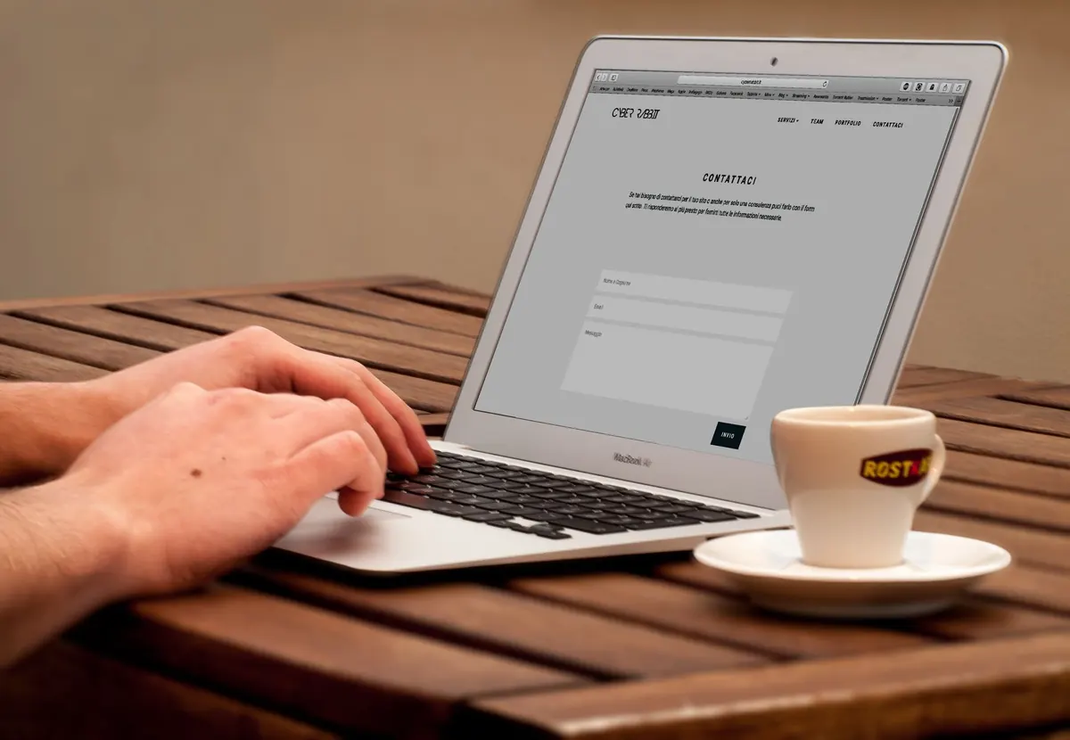
Build a Personal Portfolio Website with HTML, CSS, and JavaScript
A portfolio website does two jobs at once: it shows your work, and it shows how you build. You can buy a template, but a hand-built site proves something a template never will — that you can take a blank file, structure it, style it, and ship it. This project walks through the whole process using plain HTML, CSS, and JavaScript. No frameworks, no build tools, no dependencies to babysit. By the end you will have a responsive site you can update in ten minutes and host for free.
Plan the content before you touch code
The most common mistake is opening the editor first and hunting for a layout later. Start in a notes file instead. Write the actual copy you plan to publish: a short intro about what you do, three to five project descriptions, and one line about how someone can reach you.
For a personal portfolio, five sections are usually enough:
- Hero — your name, your role, and one sentence about the kind of work you want.
- About — two or three sentences of plain background, no buzzwords.
- Projects — the core of the page. Each entry needs a title, a one-line summary, and what you actually did.
- Skills — a short list. Ten items is a list; forty is noise.
- Contact — an email address and links to the profiles you genuinely check.
Notice how much of this is writing. Design solves the problem of presenting good content clearly; it cannot rescue content that says nothing.
Write semantic HTML first
Build the whole page as unstyled markup and resist the urge to open a CSS file until the structure makes sense on its own. Use the elements that describe what the content is: header for the top bar, nav for the menu, main for the primary content, section for each block, article for each project card, and footer for the bottom.
Keep your headings in order — one h1 for your name, then h2 for each section. Search engines and screen readers both use that outline to understand the page, and skipping levels makes the page harder to skim.
Two details people forget constantly. First, every project image needs meaningful alternative text: not "screenshot" but "Dashboard view showing weekly order totals." Second, buttons that do things should be button elements, and links that go somewhere should be a elements. Getting this right early costs nothing and saves a rewrite later.
When you finish, view the page in the browser with no stylesheet. If it reads like a sensible document, your foundation is solid.
Style it mobile-first
Start with the narrow layout and widen it later. On a phone, everything stacks in a single column, and that constraint forces you to decide what matters most. Write your base CSS for that view, then add one or two media queries around 640px and 960px for larger screens.
Layout with Flexbox and Grid
Use Flexbox for rows that distribute space — the nav bar, a row of skill chips, the footer. Use CSS Grid for the project section: a single column on mobile, two columns on tablets, three on wide screens. A few lines of grid-template-columns: repeat(auto-fit, minmax(280px, 1fr)) handles most of that automatically.
Type, spacing, and color
Define your palette and spacing once, as custom properties at the top of the file. Something like --ink, --paper, and --accent makes a later redesign a five-minute job instead of a find-and-replace marathon. For font sizes, a fluid unit such as clamp(2rem, 5vw, 3.5rem) on your main heading lets text scale smoothly without extra media queries.
Then set a readable measure — roughly 60 to 75 characters per line — and stop tweaking. Nothing dates a portfolio faster than a paragraph stretched across a 27-inch monitor.
Add JavaScript only where it earns its place
A portfolio does not need much JavaScript. Every script you add is another thing that can break, so add features that solve a real problem:
- A mobile menu toggle — flip a class on the nav and let CSS handle the animation.
- Project filtering — buttons for "All," "Frontend," and "Backend" that show or hide cards using a data attribute.
- Scroll reveals — an IntersectionObserver that fades sections in as they enter the viewport, with the content fully visible if the script fails.
- Form feedback — check a contact form before submission and show a clear error message next to the field that needs fixing.
Write it as a small file at the bottom of the page, or load it with the defer attribute so it never blocks rendering. Test with JavaScript disabled at least once; the page should still be readable and navigable.
Test on real devices and fix the small things
Resize the browser slowly from 320px to 1600px and watch for elements that break. Then run through this list:
- Tab through the entire page with the keyboard. Can you reach every link and button, and can you see where the focus is?
- Check text contrast against its background. Grey-on-grey looks elegant in a mockup and unreadable on a phone in daylight.
- Open the site on an actual phone, not just a simulator.
- Throttle your connection to a slow setting and confirm images still load in a reasonable order.
- Run the browser's built-in audit tools and fix anything flagged as an accessibility or performance problem.
Deploy it
Static hosting for a site like this is free on GitHub Pages, Netlify, and Cloudflare Pages. Put your files in a Git repository, connect the repository to the host, and it will build and publish on every push. Most of these services give you a working URL within a couple of minutes.
Before you share it, add a favicon, write a title tag that includes your name and role, and confirm the social preview image looks right when the link is pasted into a chat app. A custom domain is optional and costs a small yearly fee, but a free subdomain is perfectly respectable while you are starting out.
Keep the site alive
A portfolio that was last updated two years ago says more than any missing feature. Set a reminder for the first of each month and spend fifteen minutes on one small task: swap a project description for a sharper one, add a case study, fix a typo, or remove a skill you no longer want to be hired for.
Then keep the source public. The commit history next to a working site is a quiet, convincing argument that you finish what you start.
Photo: Pixabay / Pexels


You Might Also Like
Five common SQL mistakes, including SELECT *, missing indexes, poor joins, and NULL traps, with practical fixes for faster, clearer queries.
Git is the version control system on your computer; GitHub is where you host and share repositories. Here is how they differ, plus commands to start.